Note Card Customization
Personalize how your study notes appear in lists with layout options, display preferences, and sorting controls
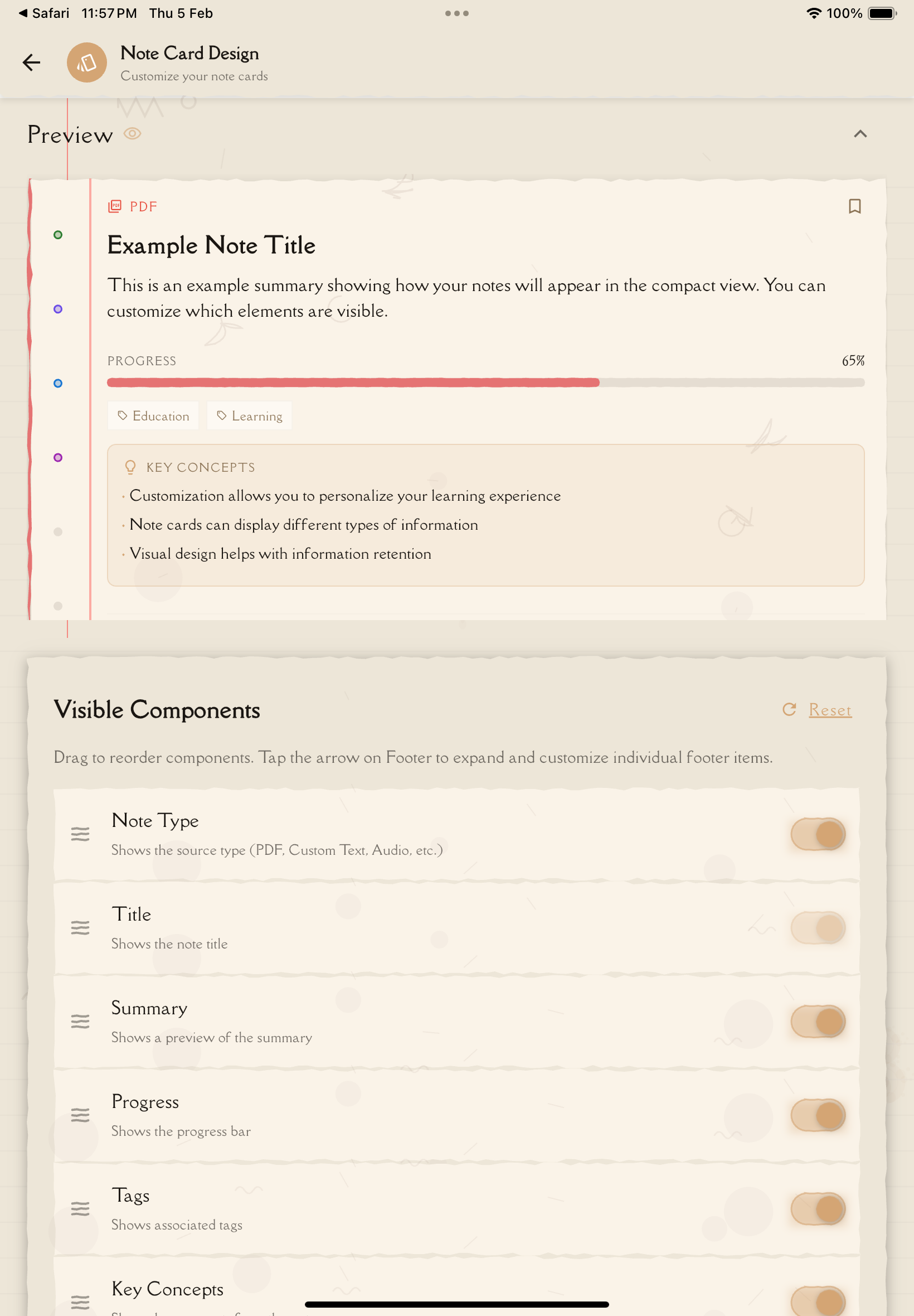
Note card customization lets you control what information appears on your study note cards in the notes list. Show or hide specific components, reorder them by dragging, and toggle punch holes to create your perfect note card layout.
Accessing Note Card Design
To customize note card appearance:
Tap the menu (☰ or ⚙️) and select "Settings".
In the Configuration section, tap "Note Card Design".
Toggle component visibility, drag to reorder, and adjust punch hole display.
Note Card Components
Each note card can display up to 8 components. You can show/hide each component (except Title, which is always visible) and reorder them by dragging.
Available Components
1. Note Type
- Icon indicating the type of note (Text, PDF, Video, Audio)
- Shows at the top to quickly identify note source
2. Title ⚠️ (Always Visible)
- The note's title
- Cannot be hidden — this is the main identifier for each note
3. Summary
- A brief preview of the note's content
- First 1-2 lines of simplified text
- Helps identify notes without opening them
4. Progress
- Study progress indicators
- Shows quiz scores, flashcard completion, study time
- Useful for tracking which notes need more review
5. Tags
- Tags you've assigned to the note
- Displayed as colored chips or labels
- Helps with categorization and quick visual identification
6. Key Concepts
- Main concepts extracted from the note
- Displayed as tags or badges
- Quick overview of what the note covers
7. Time (Footer Component)
- Last modified date or time
- Creation date
- Appears at the bottom of the card
8. Status (Footer Component)
- Note status indicator (Draft, Complete, Shared, etc.)
- Appears at the bottom of the card
- Visual badge or icon showing current state
Start with all components visible to see what information matters most to you, then hide components you rarely reference to create a cleaner view!
Customizing Component Visibility
Control what information appears on each note card:
Go to Settings → Configuration → Note Card Design.
Each component (except Title) has a visibility toggle. Tap the toggle to show or hide that component on all note cards.
Changes are reflected in the preview pane in real-time. On tablets, you'll see a split view with controls on one side and a live preview on the other.
Component Visibility Guidelines
Summary:
- Shows preview text from your note
- Hide if you prefer minimal cards with just titles
Progress:
- Shows study statistics and completion indicators
- Hide if you don't focus on metrics or tracking
Tags:
- Shows colored tag chips you've assigned
- Hide if you don't use tags for organization
Key Concepts:
- Shows main concepts extracted from the note
- Hide if you find them redundant with tags
Time:
- Shows last modified or creation date in footer
- Hide if dates aren't important to your workflow
Status:
- Shows note status badge (Draft, Complete, Shared) in footer
- Hide if you don't use status indicators
The Title component is always visible and cannot be hidden. It's the primary identifier for each note card!
Reordering Components
You can change the order in which components appear on note cards:
In the Note Card Design page, each component has a drag handle (⋮⋮ or ☰ icon).
Press and hold the drag handle, then drag the component up or down to change its position.
Release the component in its new position. The order updates immediately in the preview.
Reordering Tips
- Title is always first — It cannot be moved or reordered
- Footer components stay at the bottom — Time and Status always appear in the footer area
- Drag body components — Note Type, Summary, Progress, Tags, and Key Concepts can be reordered within the body of the card
Put the most important information at the top! If you rely on tags for organization, move Tags higher. If study progress matters most, move Progress to the top.
Punch Hole Display
Control whether punch holes are visible on note cards:
Show Punch Holes
- Displays 6 interactive punch holes on the left side of each note card
- Punch holes provide quick access to study tools (Quiz, Flashcards, etc.)
- Adds a visual skeuomorphic design element
Hide Punch Holes
- Removes punch holes from note cards
- Creates a cleaner, more modern appearance
- Saves space on the card
Toggle punch holes: Settings → Configuration → Note Card Design → Toggle "Show punch holes"
If you use punch holes frequently for quick study tool access, keep them visible. If you prefer navigating through menus or tabs, hide them for a cleaner look.
Learn more about configuring punch hole actions →
Real-Time Preview
The Note Card Design page includes a live preview feature:
Preview Pane
Mobile (Phone):
- Preview appears at the top of the settings page
- Shows a sample note card with your current configuration
- Updates instantly as you toggle components or reorder
Tablet (iPad) Landscape:
- Split view with controls on the left and preview on the right
- Side-by-side layout makes it easy to see changes as you make them
- Preview shows a full-size note card
What the Preview Shows:
- All visible components in their current order
- Punch holes (if enabled)
- Sample data to demonstrate what real note cards will look like
- Updates immediately when you toggle visibility or drag components
Use the preview to experiment! Try different component combinations to see what layout works best for your needs before committing to it.
Saving Changes
Changes Apply Immediately
All note card customization changes take effect instantly:
- Component visibility toggles update the preview and all note cards immediately
- Reordering components updates in real-time
- Punch hole visibility changes apply to all cards right away
- No "Save" button required — your preferences are auto-saved
Syncs Across Devices
Your note card customization preferences sync automatically:
- Local Storage: Saved to your device for quick access
- Cloud Sync: Synced to your user profile in the cloud
- Cross-Device: Changes propagate to all devices where you're logged in
- Sync Timing: Usually syncs within a few seconds to minutes
Configure note card design on one device (like your iPad in landscape with split preview), and the same layout will appear on your phone and other devices automatically!
Restoring Default Settings
If you want to reset note card customization to the original defaults:
Go to Settings → Configuration → Note Card Design.
Scroll down to find the "Reset to Defaults" button at the bottom of the page.
Tap "Reset to Defaults" to restore all components to their original visibility and order.
All components are restored to default visibility and order. The preview updates instantly.
What Gets Reset
Component Visibility:
- All 8 components restored to default visibility (all visible by default)
Component Order:
- Components return to default order: Note Type → Title → Summary → Progress → Tags → Key Concepts → Time (footer) → Status (footer)
Punch Holes:
- Punch hole visibility restored to default (visible)
Reset to Defaults cannot be undone. Your custom configuration will be lost. Consider taking a screenshot before resetting if you might want to recreate your current layout later!
Use Cases and Examples
Minimalist Configuration
Goal: Clean, simple note cards with essential information only
Configuration:
- Visible: Title, Summary
- Hidden: Note Type, Progress, Tags, Key Concepts, Time, Status
- Punch Holes: Hidden
Best for:
- Users who prefer minimal visual clutter
- Focus on content over metadata
- Quick scanning by title and preview
Study-Focused Configuration
Goal: Maximize study progress visibility
Configuration:
- Visible: Title, Progress, Tags, Key Concepts, Status
- Hidden: Note Type, Summary, Time
- Component Order: Progress moved to top (right after Title)
- Punch Holes: Visible
Best for:
- Active study sessions
- Exam preparation
- Tracking progress across multiple notes
Comprehensive Configuration (Default)
Goal: Show all available information
Configuration:
- Visible: All 8 components
- Order: Default order
- Punch Holes: Visible
Best for:
- New users exploring the app
- Users who want maximum context at a glance
- Small note libraries where space isn't an issue
Best Practices
Start with Defaults
Begin with all components visible to understand what information is available. After using the app for a few days, hide components you rarely reference.
Prioritize Important Information
Use drag-to-reorder to move the most important components to the top:
- If you rely on tags for organization, move Tags higher
- If study progress matters most, move Progress to the top
- If you want quick context, keep Summary near the top
Consider Library Size
- Small libraries (< 20 notes): Show all components—you have space
- Medium libraries (20-50 notes): Hide less important components
- Large libraries (50+ notes): Show only essential components for cleaner scanning
Use Preview to Experiment
The real-time preview lets you try different configurations risk-free. Toggle and reorder until the layout feels right, then start using it in your actual note list.
Adjust Based on Workflow
- Casual browsing: Keep Summary visible for context
- Study sessions: Show Progress and Status for tracking
- Quick reference: Hide everything except Title and Tags
There's no "best" configuration—it's entirely personal! Your perfect layout depends on your note-taking style, library size, and study habits. Experiment freely!
Next Steps
Now that you've customized your note cards, explore:
- Punch Hole Actions — Customize quick action shortcuts
- Study Settings — Configure study tool defaults
- Language Settings — Change app language
Or return to studying:
- Study Notes — Create and manage notes with your new layout
- Organizing Notes — Use folders and tags with visual customization